Pages

Saturday, July 6, 2013

Bushwick/Ridgewood (Bush-Wood?); The Expanding “Arty”-verse.

Although the grandiose notion of galactic gallery sprawl might seem incongruous considering the typically diminutive dimensions of exhibition venues encountered in this nebulous region of Brooklyn and Queens, it still helps to have your navigation devises up and running before venturing out to those distant reaches.
The spread of outlying outposts of artist “art”ronauts to the furthest reaches of Wyckoff-space bodes well for the future of manned art exploration in the Bush-Wood quadrant of NY’s art cosmos.

Lorimoto, Friends With Benefits
http://www.lorimoto.com/522531/home/
http://www.kickstarter.com/projects/411320567/lorimoto-gallerys-grand-opening-art-show
http://good-b.com/?p=12932


Lori, of Lorimoto


This brand new addition to the Bush-Wood ‘hood art scene extends the outer boundaries of the gallery map. The husband and wife team of artists Lori Kirkbride and Nao Matsumoto recently purchased the building, and have converted this former needle trade factory into their live-work-gallery dream combo.
The beautifully appointed ground floor exhibition space features LED lighting, original pressed tin walls and ceilings, along with traditional drywall, that nicely accommodate this inaugural group exhibition.  This is also a large square footage venue, which along with Debra Brown’s new Ten Eyck space may be bucking the trend of the familiar Bush-Wood cubbyhole.
The exhibit includes the more familiar names of accomplished artists Peter Fox, Cibele Vieira, and Rob De Oude, while introducing the art of the founder’s and other less known artists.
Judi Rosen’s “Clown Costume” is a striking piece that shifts perception between sculpture and costume design. A shamanistic impulse seems to inhabit the garment, and lends a potential of figurative movement.


Lori Kirkbride’s vivid pointillism instills her resin and polymer work with a psychedelic verve that swirls about with playful references to pompoms and retro textile patterns.


Regina Rex, FOUR PAINTINGS: Picture Window

http://reginarex.org/exhibition.asp?exID=520

If Lorimoto has a bright future, a darker shadow has been cast over the artists and galleries at 1717 Troutman. The owner of the building, described as a “monster” by a tenant in the know, seems hell bent on making life miserable for all his creative occupants. The old school, hard-ass mentality of some real estate owners renting to artists in Brooklyn is an unfortunate by-product of a dog-eat-dog marketplace, exacerbated by a fumbling city bureaucracy that can’t manage zoning issues or tax assessments in a coherent manner.
Crucial to the next phase of development and investment in the area is an ownership strategy for artists such as commercial real estate co-ops. Jules De Balincourt’s recent powwow concerning real estate issues was an important first step towards supporting a local constituency of creative professionals that might even develop clout (power in numbers).
In the meantime, Regina Rex (at 1717) has mounted an enticing exhibit that should motivate gallery goers inclined to see and be seen.
Could art really peer back at us? This is a conceit that spans many eras, most famously depicted in Velázquez’s masterpiece Las Meninas.
This exhibit is not so disquieting, yet you might find yourself feeling surrounded by paintings that implicate the viewer in some sly manner. After getting your bearings in this expansive space, the four large canvasses begin to orient in their own particular order.
Summer Wheat’s implacable depiction of a sex act asserts itself in an immediate fashion. Ms. Wheat invites us to indulge in her unabashedly exhibitionist wit. Is this glorious grotesquery masquerading as porno meant to stimulate a voyeuristic response, or is it just a hurriedly horny “casualist” gesture? The feet are some of the best post Picasso painting I’ve seen recently.


Hannah Barrett’s prim and proper (but mustached) queen of painting takes tea ensconced in an upholstered background that passes for a chair, but is really a throne to flatness. This haughty visage demands an audience, despite the ludicrous blue haired banality.


Becky Kinder dispenses with irony and embraces a kind of voluminous void. Her spooky figures resist our prying and would prefer to be left alone. There could be a reference to trauma or introversion, but the unadorned, pigmented outlines are oblivious to personality. They are the remains of departed moments, constructed as mementos to shadow and an elusive sensation of self. 


Linda Gallagher brings the most concrete aspect to the exhibit, and anchors the group with a more representational portrayal of theatrical portent. The eerie, oppressive interior could exist as a metaphor, but reeks of prison or high school in the here and now. A poignant narrative envelops the female figure. Has she suffered at the hands of the unseen, or does this symbolize
the powerlessness of victim-hood?


The artist curators at RR have pulled off a difficult feat, displaying painting balancing gesture, narrative, and insight to achieve a restrained, coherent effect that succeeds in engaging the viewers gaze with a
purposeful interaction of visual congruence.


Associated, Steven Charles, Things That Fell Out Of My Pocket

http://associatedgallery.tumblr.com/
http://www.gorkysgranddaughter.com/2013/06/steven-charles-at-associated-gallery.html
http://dadsex.bandcamp.com/

Returning to the shoebox exhibition format at Associated, Steven Charles has handpicked this show to avoid the overloaded look challenging poorly edited exhibitions. The intimate confines suit his unusual arrangement of offbeat objects.


Wrapping your head around these quirky, insouciant works entails embracing the moment. Don’t expect grandiose intellectual concept, Charles is much more interested in subverting our visual biases and aesthetic tastes by employing a ragtag assemblage of surprise media that sneak into consciousness without cognitive requirements.
It would be misconstruing the artist’s intent to label the work “untrained” or “outsider” even though he employs entreaties relating to that tradition. Instead, I find his work crossing boundaries in a fluid process that belies a sophisticated approach to an improvisational technique.   
Charles is wiling to trade charisma in exchange for an oddly gripping friendship with the viewer. You can trust this artist not to bullshit you with frills or small talk, and although there may be a decorative implication the work is far from pretty. His compulsive nature, and dumpster-diving art materiel, leads us to conclude invention is the mother of necessity for Charles. He insists we accept him on his own terms, but we are free to ruminate on the merits of his results.
What I find most rewarding about these eclectic compendiums is the seemingly easy way the artist has with his touch. There is not an once of preciousness about them, yet they exude well-tuned craft. In particular his use of orange felt as a ground indulges a playful, child-like notion of bold color, while his exceedingly repetitive, and close-up brushwork, details a candy cane-like sheet of rippled paint that conjures up a cheap shower curtain. This continual dichotomy of loose looking compositional elements, coupled with intensely focused edges, sets up an interesting tension between highly engineered patterns, and intuitive gestures that resist conventional semiotic interpretation. 


In the end, the resolve to avoid formal stasis wins the day, and these jazzy odes to uninhibited art making reflect the artist’s own musical practice;
experimental ambient audio collage electronic free improvisation live art post-punk punk rock sound-scape New York.


From Associated's web site


TCM pick of the week; A Tree Grows In Brooklyn

Directed by Eli Kazan
http://www.youtube.com/watch?v=6Ix3zZGC2jE

I finally got to watch Eli Kazan’s first film, which due to some mysterious licensing snafu has never been available on NetFlix.
What a shame. This wonderful piece of theater just adds to Kazan’s amazing canon and legacy.  That it’s his first effort in cinema makes it even more remarkable, but by that time Kazan was experienced in stage direction, and two years later would go on to found the Actors Studio.
There is no doubt that Kazan tops the list of American film directors (although closely followed by Billy Wilder), and “Tree” just confirms his genius with actors.
This immigrant story is right in his wheelhouse, as his own history coming to this country from Greece feeds the script with authentic sentiment. Working with child actors might seem easy, but getting believable performances from inexperienced players must require patience and a deep understanding of the craft. 

Relationships are what drive Kazan, and his ability to create tension and drama can reach Shakespearean heights.  

Saturday, June 15, 2013

Bushwick, The Golden Age; reviews of Resurrection, Art Guerra, Katherine Powers

There’s been some commentary recently that Bushwick has become primed for takeover by the capitalist ruling class (or “The Man” as they would say in my day), and there are certainly indications that may be imminent. But I'm also glad to report that there still is enough youthfully exuberant, funky goofball art being made in the byways of Bushwick to support the notion that a bohemian left bank still thrives.
An important part of Bushwick’s appeal to me is that a bunch of post grad artists of varying interests can still manage to scrape along learning the hard lessons of an art making lifestyle. Those few lucky enough to get through the early struggles of an art career will learn the true meaning of dedication, and have poignant memories of Bushwick’s golden era.
There are elder statespeople in Bushwick that have provided a key role by instituting infrastructure to support a youth movement. Debra Brown, Jason Andrew, and Fred Valentine have pitched in with grass roots exhibition spaces that forego the traditional model of “representing” artists to show an ongoing selection of a wide range of age and experience.
Burr Dodd’s bold entrepreneurial endeavors have made his Temporary Storage exhibition and performance space, along with the Brooklyn Fire Proof Café, into a salon style beehive of artistic interaction.  
3rd Ward has evolved into “The College of Bushwick” with a variety of distinguished curricula including innovative courses such as “drink ‘n draw”.
But I find the real spirit of a freeform interchange of artists and exhibitions in Bushwick is encapsulated by the plethora of informal group shows and studio art seen before, during, and after Bushwick Open Studios. Although BOS is the annual nexus of activity, the premise of an art scene unencumbered by a big money collector base and over priced real estate permeates an atmosphere of potentiality.
In light of this lively ‘hood I’m including a brief synopsis of a few of the more groovy efforts I’ve seen recently: 

“Resurrection” put together by James Prez at Active Space.
https://www.facebook.com/james.prez.5

Making the best of Active Spaces’s fluorescent lighting that tends to bleach out the window-less and harsh white architecture, Resurrection managed to fill out and warm the room.
Although I’m not sure how the title related to this decidedly athletic looking group of largely 3D art pieces (perhaps the bare boned nature of some the sculpture by the likes of JP Larson, dug up and reborn?), but it doesn’t really matter. If you know James, then you know its all about eclectic, and this exhibit certainly fit that Prez aesthetic.
The space is anchored by Matt Miller’s crudely carved blocks of styrofoam that have been melted or otherwise mutated in what might have been a chemistry experiment gone awry. Slapped on paint just adds to the gee wiz bang of these manly art chunks. 


 Matt Miller

Miller’s smaller scale pieces then turn the table on bravado and display his sensitive side. The wavy grid mounted on top of a photographic image magnifies an intimate reference to portraiture. This distorting manipulation could connote an aged connection to relics long past, while suggesting bad reception on an old TV. 


Matt Miller


On the gentler side of the gender geneses Rachel Hayes’ rolls of delicately transparent fabric flow gracefully into the room, conjuring up Tibetan prayer flags fluttering towards a rarified realm.


Rachel Hayes

The clunky, yet intricate jumble of clothes hangers by Bridget Mullen teeters down to the floor making a Klee-like clatter, and good use of the assigned cubicle.


Bridget Mullen

Prez has enthusiastically assembled an iconoclastic conglomeration of objects with a physical panache, and little regard for typical curatorial reliance on the contrived thematic premise.
Kudos.


Art Guerra, "Slippery At Dusk" at Sugar.
http://sugarbushwick.com/home.html
http://www.artguerra.info/
http://www.guerrapaint.com/

At the deep end of the generational pool is the primordially elegant monochrome of Art Guerra. Ostensibly paintings, these glowery meditations on nocturnal quietude, could also cloak a reference to fashionably luscious eveningwear. The sparkly spirit of Liberace might be lurking beneath those obtuse monoliths.  


Art Guerra

Guerra is well known among pigment aficionados as the purveyor and professor of rare and precious colored powders and concentrates that may be assembled into actual artist paint. This esoteric practice has merged nicely into the substance of the artist’s method. Ironically enough, you won’t find brushstrokes in these formal and somewhat imperious compendiums of pigment. Guerra’s mysterious process incorporates glass beads to produce juicy, yet serene dimensions of chromatic purity that could extend inward towards fluid biology, or move forcefully into a concrete realm reminiscent of sculptural relief.   


Art Guerra
   
Apparently Gwendolyn Skaggs who’s the brainchild behind Sugar, likes to find unique ways to present the art she exhibits. In this case Guerra’s stretchers were propped up off the floor on small oak pedestals so that the works leaned against the wall. I liked the way that magnified the weighty mass of art.
A list of Guerra’s ingredients:
Canvas, acrylic, urethane, glass beads, tire rubber, interference and magic effect pigments, pigment dispersions.

Katherine Powers, Schmatte at Store Front.
schmatte (from the Polish szmata):
a Yiddish word meaning rag, old garment, an item of clothing in fashion and clothing-industry slang.
http://kbpowers.com/
http://storefrontbushwick.com/2013/04/patrick-berran-and-jack-henry-schmatte/

The clever moniker for Storefront’s backroom project space belies a marvelous radiance of freshness that emanates from Power’s light and airy collage. The plethora of interpretive references range from Rorschach-like symmetry, to a banner deconstruction of late Matisse cut outs. Actually assembled in 8 different plastic envelopes, this collage within 8 collages still unifies gracefully into an elusive totality not unlike the way clouds morph in the minds eye.
This is what Bushwick should be all about, giving credence to the finest of art that might otherwise remain unseen in a preoccupied art world that all to often lets unspoiled beauty go unnoticed.


Katherine Powers


Phillip Taffe, Recent Work Luhring Augustine

http://www.luhringaugustine.com/exhibitions/philip-taaffe


The temptation with Taffe is to surrender to his beguiling charms, and who wouldn’t succumb? Entering into this artist’s rarified realms is like a mission quest to view the original picture.  The canvas is his archetypal Garden of Eden populated by fanciful (and fancy) marks that hearken back to an archeological sensation, while providing a beatific abstract sheen.
Fortunately Taffe doesn’t take it for granted that his sinfully delicious mastery of decorative painting shouldn’t be challenged.  If you can get around Taffe’s insistent need to keep things clean and tidy, there is a prodigious level of compositional insight and suave integrity that saturates his picture plane.
One of the more bold pieces in the show, “Sardica II”, must have taken some intestinal fortitude to paint and exhibit. This is not a pliant picture; the twisted configurations that summon up supple serpentine tripe, writhe disconcertingly, while their molten core could melt down any minute. Yet the figure/ground relationship also refers to tapestry, and this daring magic carpet ride ends up rewarding the viewer who goes along for the trip.


Sardica II, 2013
Mixed media on canvas
55 1/2 X 80 inches


A standard take on Taffe is that he reinvents historical scripts and calligraphy by blending background washes with precision draftsmanship to achieve a flat field graphic interface. 
But when he relaxes his technical prowess a less inhibited flourish can be employed, as seen to wonderful effect in “Imaginary Landscape I”
This is my favorite artwork in the show, served up as an exquisitely loose concoction of instinctual biological forms. Diaphanous creatures from under the psyche/sea hover about, crowded together in a thoroughly random jumble. Possibly we are viewing their detailed nuance under a microscope, their origins obscured by a mist of dilute pigment that serves as an ethereal suspension.  


Imaginary Landscape I, 2013
Mixed media on canvas
37 1/2 x 37 5/8 inches


John Yau's comments in his essay on Hyperallergic suggest that Taffe’s work connects to a “tribal” imperative. Certainly Taffe’s informed references to cross cultural sources rooted in ancient language and symbols may conjure up associations to indigenous groups and spiritual practice, but I don’t think tribal fits here, at least in the sense of a communal dialogue.
Appealing to a truly tribal instinct would seem to impel a more urgent, rigorous pulsation and collective reverberation of primal ritual than we see in Taffe’s deliberate and entirely civil sensibility.
The artist tends to work on an immediate, schematic level of perceptual sight lines, so despite a labor-intensive process his intricate, stenciled motif can invoke “pretty” more than substantive. Inevitably my opinionated eye is lead toward floral arrangements and wallpaper.
The work could also be seen as succinct to a fault, and risk averse. There is little room for trial and error when employing such tight mark making. Then his pension for design can gift-wrap the visual delivery, and in a contemporary context may refer back to pattern painting in a predictable manner.
Ultimately though, this work contains an essential vitality that redeems his meticulous approach, celebrating painting as formal craft. Even if you might prefer representational imagery, or a more expressive gesture, Taffe has worked hard to earn your respect, and I believe he deserves it.

Imaginary Garden with Seed Clusters, 2013
Mixed media on canvas
97 7/8 x 61 7/8 inches 


Judith Simonian, Recent Work at Ed Thorpe

http://www.edwardthorpgallery.com/artists/sim/simonian_images.html
http://www.judithsimonian.com/index.html

I was glad to see Simonian’s casually attired paintings on display in Chelsea. Their relaxed fit suited my eye nicely after the formal rigor of Mr Taffe’s well coiffed wardrobe, and the general slick-a-tude of most big money galleries in the area.
Not that Simonian is fashion conscious; au contraire, her art originates from workman-like diligence, and dedication to her painterly identity. But the show is a departure from earlier work that focused on looser picture plane architecture.
This exhibit features compositions venturing into more ambitious territory including theatrical, and still life elements that combine less strictly representational schemes with a dream-like narrative.
These paintings seem like a natural extension of what the artist has witnessed, filtered through various sensations of mood and atmosphere, finally emerging as a quasi-fictional scenario.  
 
Judith Simonian, 2013, Extreme Ikebana, Acrylic on canvas, 64h x 84w in.


  Perhaps not particularly cognitively acute in their conceptual origins, the work relies primarily on a keen sense of time and place, coupled with an astute comprehension of pictorial texture. This is the artist’s strong suit; letting her native abilities coalesce into well-construed images that succeed on their own terms, wavering between the here and now, and less defined stratifications.
My favorite paintings in the show were the still-life pieces in the last room that got right to the point of what the joy of picture making is all about. Slippery fish glisten on layers of softly undulating tints of thinly applied pigment, slathered on with a deft touch. Convincing volumetric fleshiness provides a dead fish with a fresh nod to Chardin’s forte.


Judith Simonian, 2012, Big Catch Acrylic on canvas, 44h x 60w in.


But there is more to Simonian’s craft then just painting from lovely, though unprepossessing scenery. The larger scale canvases delve into a montage format that must have been tricky to paint, but Simonian manages to pull it off. This is a good example of how a mature painter with many years behind the brush can achieve a symbiosis of sorts. Although they might not be the most graceful of gestures, there is an engaging overall charisma resulting from a savvy grasp of painting fundamentals.
The montages use an effective picture-within-a-picture conceit, slippery dimensions of tight edged planes containing crisply painted ’scapes shuffle over a background of more diaphanous regions inhabited by less defined relationships. This contrast of context and content sets up a nice tension that could relate to moments theatrical or filmic drama. 


Judith Simonian, 2010, Sperlonga in Norway, Acrylic on canvas, 54h x 46w in.


Dream imagery also enters into the equation, not so much on a psychological level as much as sensory. Since dreams are the most primal creative act, a less literal narrative in the artist’s work lends an authentic feel to the ample interpretative possibilities found herein relating to non-waking inspiration.


Judith Simonian, 2013, Blue Feast, Acrylic on canvas, 61h x 72w in.


Simonian epitomizes the “painters painter” ethos, working for her own edification more than a market. Of course, we all aspire to exhibit in a space as beautiful as what Ed Thorpe provides, and we also hope to sell enough work to establish a niche.
But I’d imagine the most important reward for this artist and others lucky enough to have found a way to make art all their lives, is to continue the marvelous adventure any way we can.

Little Willie John - I'm Shakin & The Blasters perform Little Willie John's classic, "I'm Shakin" live, 1981

 Prepare to shake!

http://www.youtube.com/watch?v=p1Y5aCt5uwY

http://www.youtube.com/watch?v=hB2kogSjyQU


Tuesday, January 22, 2013

George Bellows

Metropolitan Museum Art

Bellows’ all too short life span of 42 years was fortunately, put to good use. What must have been a gruesome death from a “neglected” attack of appendicitis, abruptly ended his workman-like output at the pinnacle of a prodigious career.
His early mentor Robert Henri provided impetus to become immersed in street life and find inspiration where least expected. In fact, the moniker “Ashcan School” was apparently based on a derogatory observation by a fellow artist commenting on a supposed scene in one of Bellows paintings of trash pickers.
He was painter’s painter, an athletic (he could have become a pro baseball player) and aesthetic prodigy whose art for the most part sustained a lean, yet lushly representational physique.
His early New York City-scapes offer youthful enthusiasm and energetic grit, and are some of his most unencumbered work, raw, yet highly perceptive and well composed. These everyday scenes of street life gain heightened sensation and portend dramatic implications.
The steamy confines of mid summer heat are felt as much as seen in compositions such as “Noon” and “42 Kids”.


   Noon
  March, 1908
  22in x 28in  


In particular the stark architecture of “Noon” prefigures Franz Kline, while “42 Kids” evokes a Dickens-sonian sense of oppressed humanity striving for release.   

42 Kids
August, 1907  42in x 60in


Although Bellows never visited Europe (I can only imagine what revelations a trip to Italy would have provided had he lived long enough to go) he studied the European masters intently. 
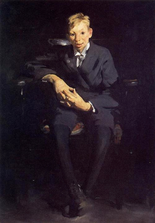
Early portraits such has “Paddy Flannigan” and “Frankie The Organ Boy” channel charged up, Caravaggio-esque distortions, subtly contorting the figurative gesture, as riveting stares emanate from jet black onyx eyes fixated with a pensive, animalistic tension.


Paddy Flannigan
  October, 1908
 30 1/4in x 25in


 Frankie the Organ Boy
 July, 1907
48in x 34 1/4in


“Stag At Sharkey’s” has become a seminal piece of Americana, right up there with American Gothic, Whistler’s Mother, and Nighthawks. This theater of violent gesture and compacted action, personifies a roguish narrative intrinsic to the early 20th century identity of brutally exuberant, and rugged Yankee individualism. The spectacle of pugnacious ballet seen in “Club Night”, confronts us with a tight configuration of pugilists, muscular and torqued, battling as rutting stags might do in combat.

Stag at Sharkey's
 August, 1909
 36 1/4in x 48 1/4in 


Club Night
 August, 1907
 43in x 53in 


The epitome of Bellows cityscapes come to fruition in the excavation scenes centered around the construction of Penn Station. Set at dusk (or dawn?) they establish an enthralling semiotic structure. In “Pennsylvania Station Excavation” streaks of white-ish yellow cloud stain a cerulean washed sky, backlighting a darkened architectural massif.
The mid ground stage set is encrusted with snow; a speck of fire centers the compositional focus, while steam “bellows” from heavy machinery. This expansive spatial volume is littered with curious details invoking a Bruegalian winter tale. The implications for a dramatic storyline are brought together by a saturated chromatic eloquence; Shakespeare could have set a scene here.
Bellows manages to succinctly transcend the literal narrative by immersing his painting in a lusciously earthed, yet ethereal atmosphere. This is one of the most difficult of maneuvers in painting; to represent the intimate fluidly fleeting moment, while embracing a formal, structured resolution of enduring stature. 


  Pennsylvania Station Excavation
1909
31 1/4in x 38 1/4in 


 Excavation at Night
 December, 1908
34in x 44i


Bellows did at times, seem infatuated by 
bucolic fantasies of the bourgeoisie gathering in city parks that fawn over gaily attired swells. This kind of ode to upper crust recreation was better left to Seurat.  
His later portraiture tended to lapse into a conventional “day job” look that may have been the result of commission-itis.  
I also found some of his daytime river scenes over illuminated, flattened out, and fixated on technically obtuse principles of perspective that distracted from, and denuded his natural tendencies toward a freer hand in his draftsmanship. 
Generally I think his darker palette worked more effectively, encouraging more expressive flair.
Although the anti war series of large paintings may at first come off as stiff, they gain credibility has eloquent propaganda posters. Heartfelt and compelling, for political art they sustain an authentic, if static, emotional outrage. 


The Barricade
October, 1918
49 1/8in x 83 1/4in
 

Bellows true crowning achievement in landscape painting comes to the fore in Maine. The surf scenes from 1913-1914 are the epitome of their ilk. Rooted in Van Gogh and Courbet, they extend into a viscous notion of frothing sea; a deeply glowing gelatinous ocean from which all painterly instinct emerges.
Bellows total mastery of the seascape is apparent in “Churn & Break”. Crashing cobalt pale green waves illuminated by a steak of sun infused fog, subsume a rocky mass saturated by misty wind blown plumes of surf. Their graceful turmoil becomes an elementally elegant metaphor for the psychic interaction of creative intuition and perceptual awareness.    
While nature serves as the medium for these action paintings frozen in time, Bellows sweeping gestures of grandeur are drenched in pigment that becomes indistinguishable from the picture plane’s barometric flux.    


Churn and Break
October, 1913
Panel
18in x 22in
Monhegan Island, Maine
1913
Panel
18in x 22in


The late landscapes make me pine for what may have come next. Prosaically ornate, they become almost allegorical meditations on country life. Although Bellows reaches the height of his powers as draftsman, these works suggest an unprepossessing manner, similar to the way outsider art can turn a landscape into a muse about time and place without didactic intent.


Lombardy Poplar, House & Mountain (Spring Hills)
 October, 1920
18in x 22in 


There may be aspects to Bellows career that seem anachronistic. Europe was bursting with creative innovation, and abstract art was careening around the corner. Staid realists from the American academy could be viewed askance, backwater bumpkins without much flair.
In the final analysis, perhaps Bellows was a 19th century painter at heart, but there is no doubt that he was also the culmination of a grand tradition. The last gasp really, before the dawn of a new era of non-representational art that would reject the long, tedious road to mastering the craft of representational pictorial supremacy.  


Macho Painting On A Mission

Micheal Chandler at Valentine Gallery
http://valentinegallery.blogspot.com/

Testosterone can wreak havoc on the road, but Michael Chandler’s driven art provides a stimulating dose of filmic action/adventure painting appropriate to an alumnus of the Jack Kerouac School of Disembodied Poetics. You won’t get white line fever at this up-tempo exhibit.
Painterly Ab Ex stud though he may be, Chandler somehow manages to avoid the pitfalls of Pollack tribute band clichés, and moves into a rarified realm of sweeping grandeur. These paintings draw you into a dimly lit region of mysterious origins; employing the classic “gaze” rewards the viewer with an eerily cinematic sensation of chiaroscuro. Who knows what creatures might emerge from this painter’s dark lagoon of a psyche?
Although the paintings don’t make your typical abstract landscapes references, naturalism emanates from their indistinct core. These are not fussy compositions; they are thrown together with flair for splatter, but despite the pumped-up, gestural muscularity end up as nuanced compilations of radiant vibrations. The dichotomy of gung-ho enthusiasm coupled with sensitive brushwork, bring the picture plane a fullness and maturity pleasing to the eye.   
Chandler is one of those deserving artists who should have garnered more attention. Although he did gain some notoriety in the 80’s and 90’s, how work this ambitious and grand has not been more widely recognized is beyond me.
http://michaelchandler.info/michaelchandler.info/M_Chandler.html

His bio is not to be missed:
     Born in Denver, Colorado, Michael Chandler was a student of Stan Brakhage at the University of Colorado in Boulder during the late 60’s and attended Art Center College of Design in Los Angeles and the Jack Kerouac School of Disembodied Poetics at Naropa. He began showing his paintings in 1985 at the galleries of Salvatore Ala in New York and Milan. Chandler has been a gardener in the Hollywood Hills, done mining assessment for the Anaconda Company, worked on Christo's Rifle Valley Curtain project, painted baseball dolls for the Pittsburg Pirates and Cincinnati Reds, was a surveyor for Contact Logging in Philipsburg, Montana, painted walls at the Museum of Fine Arts in Boston, worked on the production of Walter Hill’s movie The Warriors, painted cartoon cells for Animalympics, did installations at the Mudd Club and Club 57 with Mary-Ann Monforton and worked as an assistant to Dan Flavin through the Dia Art Foundation. Among others, he has exhibited in Munich with Galeria Paal; in Seoul at Gallerie Seomi; in Bologna at Galleria Comunale d’Arte Moderna; in Rio de Janeiro at the Museum of Modern Art; at the Rhode Island School of Design’s Museum of Art and in New York City at P.S.1, the Drawing Center and the American Academy of Arts and Letters. Most recently his work could be seen at Jules de Balincourt’s Bushwick Basel. Chandler has worked out of his Lower East Side studio since 1980 and this is his first one person show in New York in 15 years. 


Installation view at Valentine Gallery


NetFlix Pick of the Week

La Ronde, 1950, directed my Max Ophuls.

Ophuls was the consummate humanist; his films always seem to bring out the sensitive nature of relationships and their romantic implications.
He was also one of the most stunning set design artists of his generation. The theatrical elegance of his interiors is particularly engaging. These fanciful, dream-like environments provide mesmerizing montages that evoke surrealist influences. 
La Ronde is in particular one Ophuls most accomplished works. Set at the turn of the century, an MC wanders about a cleverly contrived stage set that morphs into the first vignette.  Presented as a series of interlocking segments, the story meanders about the lives of lovers indulging in various dalliances. These are sentimental fantasies of a more gentile time when extra-marital affairs were discretely and delicately sweet incidents of innocent intent.
Unfortunately theres not much of a selection of clips to view, but if you’re willing to wade through Criterions pre video ads I’ve included this link:
 http://www.tcm.com/mediaroom/video/258841/La-Ronde-Movie-Clip-You-ll-Be-Sensible-.html
Theres also a nice still on UTube that plays the movie theme music, a waltz that will stick in your head all day:
 http://www.youtube.com/watch?v=9K1eyQeex7Q

Saturday, December 29, 2012

Interview with Jongil Ma.


Conducted by Eliot Markell

The artist.


EM: Jong what can you tell me about your Socrates Sculpture Park installation “To You, Little Bigger Than A  Sweet Summer Pink Peach” and how it was affected by hurricane Hanna in 2008?

Started the installation in middle of July, I had prepared the material way before July. Weather was dry and very hot during the August, the major installation period.
My face so tanned, completely dark, after working over the summer. My Mia, my jackrusell terrier, struggling over the summer with the pregnancy. Sometimes I saw her belly was touching the ground because of her short legs. On 31st she gave a birth, one of the three puppies. She was struggling for another one, but Mia was too small for the one. The puppy died. She screamed. I cried. I asked forgiveness to her for my ignorance. 
Through all the drama, on the 3rd of September, I was thrilled to complete the piece. Next day there will be an opening, glorious indeed. From around 3 o’clock I started to feel some raindrops. I was rushing the final touch. There had been a Weather forecasting kept repeating that the major hurricane, Hannah will be NY state area by tonight. Around 5 PM rain was pouring. I did not know if the heavy rain was making the ground muddy, soft. Maybe the heaviest rain amount ever since I move to NY. Even the rain was more after 7 PM. I could not keep working. I stopped. Cleaned the site. Came home around 8 pm.
I throw all the wet stuff away into the bathroom.
Took a shower. My body was dried, felt so good.  After a long time finally I was in peace. I slept, dreaming to see in tomorrow opening, my glorious offspring, “To You, A Little Bigger Than A Sweet Summer Pink Peach”.
I slept 9:30 am. Wake up noticed that the director of the park left an urgent message. I rush to the park. Weather was incredibly calm and clear blue sky. Under the blue sky, I saw 2/3rd of my offspring peacefully laid down. It was still beautiful and sad. Many people in the opening even did not know what was happening. They thought that was the original state or intention of the artist.
I erected the piece after three more weeks of working. And it had stayed for the entire 7 months, until March of 2009. I was surprised that a whole processing for the installation was very the same as my life journey. 

Jong's sculpture To You, A Little Bigger Than A Sweet Summer Pink Peach”shortly after blow  down.


Resurrected.


 Detail; “To You, A Little Bigger Than A Sweet Summer Pink Peach”. 


EM: Would you say your Korean heritage affects how your art has evolved?

The life in the nature, the limited openness to various cultures obviously makes grow something inside of me. 
I grew up in the very rural southern Korean village. I got naked until I was 7 years old. Major my toys were sand, stone, wood, bamboo and soil. I always made something by cutting down some pine trees, bamboo and other natural material. Other wise life would have been too boring.
No cars no electricity until I was 2nd year in the elementary school. When all the adult people went out to the farm around late spring, I used hear mourning dove breaking absolute silence and I hated it. 
When Winter season, we fire the ‘Ondol’ Korean way of heating floors/rooms. The floor made with thin-wide flat rocks and smoothed out with mud. The floor located few feet above the firing place underneath.
An hour firing heats the floor until early in the morning. I rested and slept on warm rock floor and went out running around on the snow, spinning tops, or fly kite then came back to the room to warm my body up.


When I was 8, I nagged my father to send me to Seoul. I knew what was the city like because I traveled there by myself since I was 5th grade. I was very excited to experience so many new people, tall buildings and new culture, like film theater, restaurants. I moved to Seoul when I was 8th grade. Just two months before I graduated the high school I started work in Daewoo as an accountant and regular office work. The second military dictator, Jun Doo Whan, occupied president office.  I served for three years of mandatory military service in the DMZ.
I came back to the office right after complete the military service. The military experience gave me a lot of positive energy during the time but now I think there had been so much unreasonable abuse too. I often, these days keep thinking about the relationship between an individual and the nation.
After jumping around here and there for learning some basic design or fashion design I decided my real job should be to become an artist because I thought this is the only way to live freedom of life.  I struggled for few years and finally I came to NY.

EM: What was it like immigrating to the US as an unknown art student without any support network?

I was not exposed to foreign culture when I came here. Upon my arriving I was like dry sponge absorbing new culture. Everything was excited to see, feel and experience. Some art, music is still making me feel excited now. I studied English for a year. It was a big challenging. I still could not pass the English proficiency test until the beginning year of senior period in SVA. I started fine arts major in SVA in 1997. For studying fine arts, SVA was the greatest place. Many teachers were actively showing their works in the galleries. Discussions in the class, frequently toured major galleries almost every month were major impact to my soul as an artist. I thought I almost saw my dream is coming to be true. I almost touched it. Even after full 12 hours of labor in the supermarket during the night hours, I could be very excited and enjoyed the class. I acquainted friends. I took an advantage to see a lot of films when I lived near the Kim’s Video around 1999.
After the physical labor it was not easy to read books. Instead I decided to see some great films. Those of great film directors, Andrei Tarkovsky, Ingmar Bergman, Pier Paolo Pasolini, Abbas Kiarostam internationally renowned, their intensity of creativeness, changed my perspective as an artist meanwhile I feel a shame that I did not know those hard working artists before coming to NY.
After a serious pondering about what to do as an artist, I felt wood really connects to my body.
I started to make a simple figure with wood, and that is my base of current works.

EM: I really enjoyed both your Governors Island installation for LMCC and your Taller Boricua piece. Please give me some idea of your process and purpose with these 2 works.

In the LMCC new gallery opening exhibition in Governors Island, I was focusing on two different matters, one was to express my own idea, which bring the structural essence of modern bridges, building and its delicate balance. This was a metaphor to our complex political, social relationships. It is a kind of so sublime meanwhile so dangerous and very temporary ephemeral life aspects in particular. The key word was tension. Each pieces have the very right amount of tension to stay as it stay in the right position. If it was too week strip then added to another or twist it to have the right amount of tension to be exist and hold another around the piece.
Another my concern was that how I participate with the audiences who are mostly not the professional artist to the Island. It was always a matter to me spending time whether I pursue my own pure idea or consider the circumstance, another way of telling, what is an artist’s contribution to the society or how I mingle myself with the viewers.
As other my previous pieces did the pieces allowed people walk around or into the piece. It provided all different images as you look from the different side.
It was mostly the same intention when I did the installation in Taller Boricua gallery except I tried a lot more trying to be improvising it many moments.

EM: I know the AIM program gave your career a big boost, how would you compare that to receiving your recent Pollack/Krasner award?

Through the AIM program I have some great chances to expose myself to the public. I had a pretty big project in Randalls’ Island in the summer 2011. As I wish I could install my piece in between Hell Gate Bridge and Tri borough bridge.
I had a great amount of support from the city park organization. Right before I started this piece there was AIM biennial exhibition. I had a chance to install in the lobby of the Bronx Art Museum.
After all these busy schedule, the difficult life was not resolved as an artist. But eventually at the end of the year, just before the Christmas, I got a phone call from the Pollack Krasner about the approving of the grant.

EM: Your new furniture pieces seem to bridge references to fine art and high-level craft. Are you familiar with the early 20th century arts & crafts movement has it affected the way you think about your art objects? Do you see your furniture pieces connecting to your art or as something in between or even separate?

It was not the idea of early 20th century art & crafts movement.
After many times of my strong egoistic trial in those installation pieces, I was becoming a little bit skeptical about what I have been creating, a lot of times, specially in certain local place where most neighbors not so familiar with current art world. Furniture was my attempt to bring the tight relationship between artist and viewers. My furniture piece always will be separated with my artworks. However when I make some furniture pieces I try very hard to bring authenticity and unique creativity.

EM: What would/does your ideal career as an artist looks like?

I can talk about my role model to answer to this question. My role models are Neil Young and Martin Puryear.
Neil Young is the one has great energy for creating music and playing it. Meanwhile he has brought constantly to let the people know about cruel human power.
Martin Puryear is the one persistently trying himself in the position to separate from the absurd commercial art world. As a result he has very clear own aesthetic language in his career. Currently I am having unbelievable difficulty as an artist because of lacking of financial support either from out side or by my own sales activity. I aware how much difficult matter it would be as an artist to keep away from the commercial influence and keep his own purity. These two people are perfect example for the good and it is true power to make our society exist for the right future. 


Left, detail. Right, street view of Jongil Ma's installation at The Rodger Smith Hotel.

Photograph by John F. Morgan 14’ x 50’ x 12’
Wood, Rope
Wow Baby, That Sounds Fantastic And You Look So Beautiful Indeed
 
Photograph by John F. Morgan 14’x22’x9'
Wood, String, Tape
After Having A Wonderful Dinner With Beautiful People, He Went Back To The Place He Was Supposed To Belong To