Pages

Monday, January 24, 2011

Shop ‘till you drop (to your knees); Charles LeDray, WorkWorkWorkWorkWork Whitney Museum

http://whitney.org/Exhibitions/CharlesLeDray


LeDray’s mid career survey includes an installation piece “Mens Suits” that harkens back to the good ‘ol days of musty bargain basements, perhaps populated by invisible little denizens from a Twilight Zoned dimension.
A “worms eye view” perspective of seedy looking suits neatly arranged on racks, with carefully folded tee shirts, and “back room” paraphernalia such as dollies and hampers full of hangers is spread out on the floor in 3 segments in a large darkened gallery. Getting a good look at these mini dramaturgies requires bending at the knees (watch out for your back!), but is rewarded by an entrancing glance into the compact psyche of an artist model maker extraordinaire.
The issue of scale is first and foremost in these intricately conceived sculptures. This universe of shrunken garments, never meant to fit our bodies or perceptual norms, magnifies our ungainly physical presence as giant viewers tromping about the delicacies on display.  
The notion of missing persons and departed souls engages the artist’s prosaic intentions. Detritus from lost childhood innocence and a sentimental longing for a father’s long gone uniforms, informs our sense of the vacated space that these constructions inhabit, a void surrounding and insulating the artist’s sensations of loss and memory.
LeDray has made his marks in the art world playing “small-ball”, at times barely managing to avoid clichéd lapses into Peeping-Tom dollhouse fascination, and then emerging with impeccably crafted objects profoundly freighted with the dysfunctional trauma’s of abandonment and abuse.   
His obsessive compulsion to grind out in exacting detail, the myriad components of midget clothing accessories right down to tiny miniature shirt buttons is astounding. Its kind of like going to a freak show without the freaks, just their accoutrements are on display.
But these leftover garments are poignant symbols of the fragile interrelationship between father/son, work/duty, and homosexual mores.
“Overcoat” epitomizes the artist’s approach to eloquently layered levels of metaphor and fabric. This freestanding edifice couples a suave formal classicism with an outsider vernacular. Displayed on a ubiquitous hanger, resembling an overstuffed tent protectively cloaking many smaller coats, it insinuates lives within, containing a collective consciousness of unknown identities.   
“Jewelry Window” pays stark homage to victims of AIDS. Set in an inky dark room the hushed acoustics mute the raw emotional resonance portrayed by gracefully sweeping necklines of empty black jewelry display forms. This funereal vitrine is backlit by a diffuse pale fluorescent source that sustains a disturbingly dreamlike, otherworldly effect of dissolved souls gone to the other side. 
It was with some relief that I reemerged with my physical body intact in time/space.  
Its not all doom and gloom with LeDray. He has a whimsical side that manifests itself with delightful results in some of his flat pieces. Associations with quilted matrix and collage are seen as inventive takes on those traditional media. Although there is no painting or drawing in this show, the artist’s deft hand convincingly substitutes thread for the drawn line and colored cloth for chromatic fields of pigment.    
Like other virtuoso talents, Ledray can get carried away by his own golden touch. There are instances when his neatness and perfectionist tendencies can get tedious and precious. The devotion to preppy men’s jackets in various states of shredded mayhem repeats itself a few too many times. The cuteness factor of fashionably adorable apparel occasionally veers treacherously close to product placement.
The artist could also be accused of self-absorbed, autobiographical indulgence but we don’t know this for sure. Even though his work is rooted in representation he keeps us guessing as to context. You have to carefully consider relationships to not only implied personal histories, but the cosmic condition as well.
One thing for sure, LeDray’s unflaggingly macro dedication to prolific micro art making is interwoven into the fabric of his deliciously nuanced and multitudinously tiny & tidy creations.

"Mens Suits"


"Overcoat"


"Busy Line" from Rose Murphy

The "Chi Chi" girl from the 30's & 40's. Played "intermission" piano for the Duke uptown. Her squeaky little girl voice has an Afro version of Betty Boop written all over it.
http://www.youtube.com/watch?v=WQBQMklZ1aM

The Ruins Of Detroit

The French shaming us convincingly and compellingly.
http://www.marchandmeffre.com/detroit/index.html


Worker Safety Posters from English Russia

More gleefully graphic mayhem from the Soviet era, ouch!:
http://englishrussia.com/index.php/2011/01/15/look-out-soviet-bloody-posters/ 


Sunday, January 9, 2011

“PILL POPPERS”, FRED TOMASELLI AT THE BROOKLYN MUSEUM

http://www.brooklynmuseum.org/exhibitions/fred_tomaselli/


Being the SoCal surfboard maker dude he was Tomaselli’s exhilarating ride of a mid career survey does hang ten, but he doesn’t catch every wave in this polyurethaned miasma of natural and art history.
Tomaselli’s earlier work that got him a measure of renown in the late 80s featured painstakingly arranged rows of pills and herbal tablets that fan out into psycho pharmacologically inspired mandalas. His signature ”move” of coating his flat creations with a thick pour of poly created a novel visual read, imbuing his montage with an “under glass” intrigue, much as amber entombed insects invite scrutiny.
Speaking of which, as his later work branches out he does indeed begin a fruitful investigation combining art historical, entomological, and ornithological sources that includes intricately cut out images from magazines and books inserted into tightly composed diagrammatic motifs.
However the tactile theatricality of these collages become ornate to a fault. Wherein lies the dilemma inherent with visual art that relies on the literalism of assemblage materials to impress. At worst Tomaselli’s work risks lapsing into a “bar countertop” convention of overly precious eye candy you’d put your beer on and gaze dreamily down at. But then this artist proves his painters savvy when employing abstract gestures that elevate content of works like Echo, Wow, and Flutter to an exalted level of artistic rank.
It pains me to say the uneven nature of this earnest artists efforts result chiefly from his devotion to craft. I admire his dedication to art historical references, and the flora and fauna that inhabit his psyche, but he seems to lose sight of the forest for the trees. He gets so wrapped up in technical execution that some of his work begins to feel forced. To Tomaselli's credit some of the recent panels like “Big Raven” largely forgo the use of extracurricular media, and display a nuanced use of pigment to achieve a taut chromatic scheme and are quite successful.
Yet clunkers like his owls eye piece are bafflingly tiresome clichés of prettily painted pointillism. There are also lapses into Arcimboldo-like portraiture and science museum “transparent body” figuration that if they’d been done with a witty intent might amuse, but here just disappoint.   
You can’t help but enjoy this artist’s overall decorative talents and inventive take on collage; I just wish the polished virtuoso were not so highly prized in today’s art market.

Echo, Wow, and Flutter


Detail, Big Raven.

SEDUCTIVE SUBVERSION: WOMEN POP ARTISTS, 1958–1968 / THE DINNER PARTY, JUDY CHICAGO- THE BROOKLYN MUSEUM


No I’m not writing this just as an excuse to post some naughty pictures, but after all it seems to have been what these pop art feminists’ preferred.  
This eye opener of an exhibit is not all ironic smut, the captivating sculpture of a sea cucumber (not really, but the floppy fabric phalluses could be underwater) encrusted easy chair by Yayoi Kusama, a protégé of Louise Bourgeois grabs your attention.
Directly adjacent are the very 3-D busty busts of Marjorie Strider. The triptych of a carved wood bikini clad lass owes much to Warhol & Lichtenstein, but would have made a good backdrop for an episode of Johnny Carson.
Dorothy Iannone’s kooky canvas “I Love To Beat You” displays a primitive looking Amazonian goddess enjoying the attentions of her real-life partner known for sculpting in chocolate. Yummy.
Kay Kurt’s large-scale homage to super realism manifests as an open chocolate box. Pick your poison.
Since 2007 the Brooklyn Museum has devoted a significant portion of the 4th floor to a well designed home for “The Dinner Party” Judy Chicago’s iconic sculpture/memorial to women, goddesses, and go-go girls.
I’d never seen the original and wasn’t expecting to be particularly enthralled being the macho chauvinist that I am, but I was won over immediately. This sincere yet at times irreverently playful compendium of ancestral sisters centers around 39 ceramic 3-D plates placed in a triangle. The engaging conceit that these place settings represent a party about to take place adds urgency to the sense of presence. Although not all the platters entice, the better ones are cleverly crafted innuendoes glorifying the female genitalia in a delectable manner.
Wish I’d been invited.


Sideshow Gallery “ It's All Good apocalypse now!!”


Attendance at Rich Timperio’s (Williamsburg own impresario) annual opening night come one, come all group grope of a salon style conglomeration of mostly little known artists hepped-up on even the remote possibility of being noticed, is always invigorating.
If there were any doubt concerning survival of the clan of “The Hardscrabble Group” after a couple of rough years for continuing art production without much compensation (job or art related), this exhibit should quell such worry.
Even the live chicken (a fancy looking, well quaffed bird at that) in its cage (metaphor?) mounted directly over the entryway door seemed keen on networking.
To quote from Mr Timperio’s press release:
You don’t find yourself playing in this, or any other Timperio scenario by way of a letter of recommendation. Nor does he pour through slides. His door is open, the work makes it way to him to talk or howl to him in person, as in the good old days, in this case still here and now.
Timperio is a Prospero who by arcane magic commands some Ariel to conjure up this whirlwind of mostly shattered, vacated, and fractured images; so when it hits you in the eye like a big pizza pie, if you don’t immediately know its amore, hang in.
http://www.sideshowgallery.com/index.html 
Rich Tiemperio
My sculpture piece between pink canvas and swirly star.
Jeanne's crotchet piece above black squares.
Vincent Dion, top row, second from left w/ frame.
Lydia Viscardi, fish image, right.
During opening.
Trying to get in.
The Big Shove.


THE AWARD FOR MOST EMBARRASSING COMEBACK ATTEMPT BY A WARHORSE ROCK STAR WHO SHOULD HAVE KNOWN BETTER, GOES TO:


Paul McCartney for his recent SNL appearance while performing an excruciatingly painful off key version of Band on the Run.
Alas! Poor Paul, we thought we knew you.

JOIN THE NAVY AND SEE…WELL YOU KNOW.


(former) Captain Honors in his infinite Cinéma vérité wisdom had nothing on early 20th century queer illustrator Frank Xavier Leyendecker.
This patriotic, wish-he-coulda-been-a-homo-sailor would have made Popeye blush. Shiver me timbers!


Found on Washington Ave near the Brooklyn Museum on a particularly dog shit littered section of side walk. 
Believe me, I understand why people hate King Bloomie, but please, either clean up after your canine or just let 'em poop on your kitchen floor.

Tuesday, December 7, 2010

BRICE MARDEN “LETTERS” AT MATTHEW MARKS GALLERY

http://www.matthewmarks.com/exhibitions/2010-10-29_brice-marden/


The grandiose, wide-open wall spaces afforded the viewer at MMG on W 22 St are used to great advantage by Mr Marden, aka (affectionately known as) “the meathead” to Jeanne and me for his somewhat hilarious interview with Charlie Rose after his MOMA retrospective.
Despite his suspect public speaking abilities, his painterly instincts are seen here in full force. Much has been made concerning Marden’s worldwide travels prior to this exhibit; the artist describes the work as influenced by Chinese calligraphy he studied during those sojourns. The expansive scale of the 4 large pieces in the central room exude a quietly exuberant elegance, but seem less calligraphic than Western, evoking the metaphorical presence of an ancient Grecian portico reminiscent of the artist’s youthful aesthetic journeys’.
Marden could be considered a well-traveled painter, his work has spanned many stylistic incarnations, and to his credit he has always been willing to risk his market to explore the furthest reaches of his artistic interests. Even though these wanderings have not always been fruitful, the work in this show demonstrates Marden’s diligent mastery of the dichotomies between painting and drawing, contemplation and action, motif and improvisation.  
At first glance, these highly engineered, yet unforced compositions may seem typical of his recent tangled webs of banded color that twist their way around the surface of his picture plane. But in a new “twist”, the artist has reinvented the monochromatic semeiotics from his early work. Vertical columns of muted color appear on the left and right sides of the canvas, bookending swirling ribbons of coursing pigment that might otherwise lose their way. These subtly modulated chromatic blocks oscillate, sometimes as pillars supporting the painter’s temple within, other times they recede, becoming the backdrop for a stage of abstract activity.   
On a technical level Marden’s art really boils down to the question of whether a drawing can be painted, but his works on paper in this exhibit are less about the process of draftsmanship and modeling then as a meditation on the inner eye. Sub visual content of facial symmetries and synaptic patterns become inherently schematic, but pulse with the urgency of a Pollack. Though initially seen as flat, on closer scrutiny the succulent surfaces of his painted drawings offer lushly felt sensation. There is an illusionary depth in the paintings that gains credence as result of the works on paper; certainly one could not have been without the other.
Marden’s art would not be considered as an imitation of nature, there is a synthetic complexion intrinsic to the overall visual response. But the natural world resonates in Marden’s palette infusing the paintings with compelling artifice, (much the way silk and myrrh entice) while their visual eloquence speaks volumes about a painter who need say little.

THOMAS NOZKOWSKI: RECENT WORK, PACE GALLERY


Nozkowski’s gracefully understated, slightly fantastical world of painting and drawing is an intriguing place to visit, theres even comfortable seating available.
Well okay, not real recliners but at least a quirkily rendered version of an arm chair-like apparition floating about the Matisse-ish fabric of this delicate diagram.
The pleasurable experience gained from Nozkowski’s interpretative gem’s stem from devotion to simplicity of line. When he gets it just right (this show has a bit too much work, the more geometric pattering in some of the pieces was trite and could have been left out) there’s a delicate balancing act that delights the eye. Color keys the temperature sensitive nature of his art, heating it up and cooling down as necessary, while gradations of shading shift a viewer’s perception between line and form. A Klee like reduction to bare essentials does not denude the pictures of sensation, rather it clarifies the distinctions of flat planes that gently undulate in and out of figure/ground relationships creating an illusionary pictorial depth.
The associative references of his compositions run the gamut from sub atomic particles to the “inner” landscape of architectonic structure. But that’s the fun part of gazing at art that plays with our non-literal abilities to see things in a child-like manner. You get to make it up as you go along.       

ANSLEM KIEFER, “NEXT YEAR AT JEURSALEM”, GAGOSIAN GALLERY


What would German painting look like without World War 2 weighing so heavily on the oeuvre?
More pinks and sky blue in the palette I would hope.
Yet despite the hopeful Jewish mantra for a homeland, this grimly gray, gargantuan opera set of decrepit detritus from fascism and war leaves me with little more than angst to go on.
The powerhouses of Kiefer and Richter have always dominated German post war art, with Joseph Beuys fueling Kiefer’s flame. Although Richter has usually been seen as the virtuoso performer with a huge retrospective at MOMA, Kiefer is no slouch. His mega panoramic treatises from the early 70’s such as  “Germany’s Spiritual Heroes” broke new ground in the heroic scale department, and were actually pretty good paintings. His use of cast lead to fabricate open book pages took an innovative to approach sculptural media, and led (no pun intended) to the ever-popular “floor piece” requirement for big time Chelsea painting exhibits. (this trend has mitigated somewhat recently, nothing on the floor in the Marden or Nozkowski shows)
The Gagosian space on W 24 St is well sited for catering to the over-sized, well fed ego (and art) of art star luminaries such as Richard Serra, whose piece “Ali vs Frazier”, a solid Buick sized chunk of forged steel graced the floors of that august showroom.
Kiefer has joined the party, and not been outdone. He is a worthy heavyweight opponent for Serra, and NY@J carries on the tradition of bigger is better (or at least bigger).       
This heavy-handed, over bearing, and over crowded conglomeration of intimidating art objects actually manages to make a succinct impression despite itself. Its like wandering through a mausoleum museum dedicated to obtuse memorials fashioned from scraps of arcane wartime memorabilia. The rusty, used-up flavor of these ancient implements of destruction are effectively magnified by items such as a torn up old section of a military aircraft cockpit and an enormous seized up engine block from an allied “Flying Fortress” bomber.  
The massive glass vitrines encasing the objects de art steal the show at least as far as the “shock and awe” factor is concerned. Some of these transparent sarcophagi tower 20’ high, bound together by thick steel braces they emphasize entombment as a conceptual construct reflecting Beuysian strictures of containment and isolation.
Whew.
And if that weren’t enough theres the actual paintings. These monolithic behemoths, slathered in inches thick pigment seem to stride off the wall confronting anyone foolish enough not to be bowing to their magisterial command. The sweeping grandeur of mountain ranges, and snowy, birch-studded woodland (with sticks and leaves of actual brush tucked into the base of the frame) rendered in a roughly hewn manner divest the viewer of any notion of preciousness. These are he-man paintings that don’t fool around.  
The dirge-like atmosphere of this glassy menagerie makes it’s oppressive, but morally ambivalent point. Kiefer does not take sides, ultimately he’s accusing us all.
One thing for sure though, this show made me glad I’m not an art handler at Gagosian!  

White Elephant On Wheels recipe pick: Liver Rolls With Stuffing


 Fried liver rolls – a traditional Ukrainian dish.
Unfortunately Jeanne won't let me make this in our domicile. But an excellent recipe nonetheless!


Sunday, December 5, 2010

Eliot’s picks; best food, art, TV, & and shopping

Yee Kee HK Style
1232 Ave U
718 336 2338

After stumbling onto Robert Seitsema’s Village Voice blog touting the virtues of Brooklyn’s relatively low profile strip of Asian restaurants in the Gravesend section, we have since made 2 trips to Yee Kee HK Style.
Both times we’ve been rewarded with finely crafted flavors and textures that rise well above your average Chinese fare.
The place is typically well lit but not a big room, maybe 20 or so tables. There are a couple of wide screen TV’s that feature what I’d guess are Hong Kong game show, soap opera type programs. They kind of add to the ambience. The clientele seems geared toward middle class Chinese family groups, most of the tables are of the big round variety.
One important tip if you go, make sure you bring the paper take-out menu to the table, it has everything on it. The regular table menus (at least for non Chinese) don’t have some items that are on the take-out version. No rhyme or reason for these seemingly random omissions.
Following Seitsema’s advice we ordered both his favorites, and they soon became our’s as well. Chicken Chow Zhou Style features an amazingly delicate garnish of deep fried spinach. The spinach is not battered, it comes to the table looking like dark green tissue paper, and melts on the tongue with a subtle garlicky essence.
The Farmer Special contains a wondrously varied mix of crispy and silky vegetables piled high in a sculptural display quite pleasing to the eye (not to mention the palate).
Don’t miss out on the Salt Baked Squid either. This standard dish is elevated to the next level with plump pieces of calamari coated in a smooth but crunchy coating, served on a bed of freshly shredded, mildly spicy little green peppers.
On our second visit we indulged and had Lobster with Scallions. I’d seen this dish go by on our first visit with pangs of envy, had to have it.
It lived up to its reputation. You actually get “twin” crustaceans, of the small soft-shelled variety hacked up into pieces. Most times when I order lobster in Downeast Maine I avoid soft-shells since they tend toward being watery and not as bold tasting. But in this case soft shell lent itself perfectly to the recipe.
The softer shells are actually somewhat chewable (proviso here; I like to chew chicken bones, especially the tender tips) which is all the better to savor the ginger/scallion sauce that clings to the delicate tasting meat and shell.
There are some adventurous sounding dishes on the menu I’d love to try sometime with a bigger group (Jeanne is not game):
#220 House Frog
#156 Crispy Fried Intestines
#157 Pan Fried Ground Meat (?) with Salt Fish
The only caveat I might apply pertains to a minor (I hope) sanitary issue we experienced.
There were some little fruit fly type things flitting about on our last visit. So it was with some chagrin when we learned after checking them out on NYC’s restaurant health violation list that they’d actually been closed twice in the last year for some rather egregious sounding gaffes. Their most recent inspections have been much improved, I’m wondering if they changed ownership. I inquired about the chef the last time we were there and I was told that he’s the current owner and previously had restaurants in Shanghai and Hong Kong. The place looks clean enough, but we were both feeling a little intestinal distress the last time, but that might be because we had a lot of spicy food.
Heat Waves in a Swamp: The Paintings of Charles Burchfield at the Whitney, until Oct 17
whitney.org/Exhibitions/CharlesBurchfield/Images

Before seeing this exhibit I had only a vague notion of Burchfield’s work, mid century American realist is about as far as I’d go. After viewing this exhibit though, I’d say he’s right up there with Hopper, Bellows and T H Benton. Its likely that he never received much renown partly due to being a reclusive artist that stayed far from New York City.
But that turns out to have been a trump card for him. He thrived in the hardscrabble industrial heartland of the midwest, painting mostly from nature but also some stunningly bold architectural visages that thrust his work into an architectonic realm. However his exalted watercolor landscapes, done with a spiritualist, shamanesque fervor are the mainstay of his oeuvre.
Then he’d turn around and do a magazine illustration for Johnny Walker Red. He also did some wallpaper designs that were inventive and ingenious.
For an artist and illustrator that was somewhat obsessed by motif, he still managed to transcend his prodigious skills as a draftsman to imbue his painting with otherworldly alien-like scenery. His nightscapes are especially eerie, and tend to evoke the silent midnight murkiness of the dimly visible.
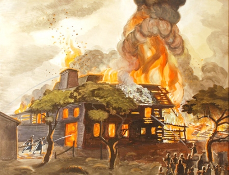
Charles Burchfield, Pyramid of Fire (Pyramid of Flame), 1929, Watercolor on paper, 51 x 81.3 cm, The Charles Rand Penney Collection of Works by Charles E. Burchfield at the burchfield Penney Art Center, Buffalo State College, 1994.
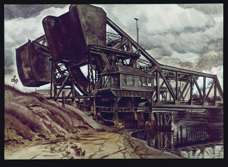
Charles Burchfield, Black Iron, 1935, Watercolor on paper, 71.1 x 101.6 cm, Private Collection.
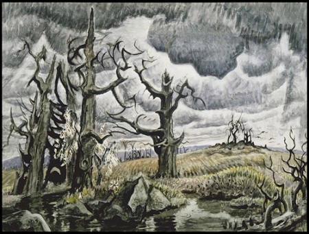
Charles Burchfield, An April Mood, 1946-55, Watercolor and charcoal on joined paper, 101.6 x 137.2 cm, Whitney Museum of American Art, Purchase with partial funds from Mr. and Mrs. Lawrence A. Fleischman.
Breaking Bad, seasons 1 &2, on AMC
Available on NetFlix

The best part about watching series like Breaking Bad on NetFlix is that you don’t have to wait a week between episodes. The worst part is that after being glued to the screen for 2 seasons worth of all the Tarantino-like black humor gore, and gripping Hitchcockian suspense we have to wait a year for season 3 to come out on NetFlix. This is made all the more excruciating by the knowledge that season 3 is already over on AMC, and everyone but us knows what happened.
Oh well, its only TV, but what TV it is.
For those of you poor unfortunates that haven’t partaken of this twisty-turny, topsy-turvy humdinger of a yarn I will fill you in as best I can without spoiling it all.
The premise of this fascinating work of fiction tells the story of a humdrum but technically brilliant high school chemistry teacher who is diagnosed with advanced lung cancer, and given little time to live. Oh yes, you might think, “how contrived/clichéd a plot device is that”?
But Walter White, chemistry teacher, turns out to not be your average “going to die, what do I do, kinda guy”. Instead he takes up with a former flunker meth dealing student of his to cook methamphetamine to make as much money as possible before dying for his broke middle class family, which consists of a 16 year old with cerebral palsy and a pregnant wife prone to cleavage.
Shot on location in Albuquerque NM, (beautiful cinematography and film editing) Walter tutors his former student Jessie on the nuances and niceties of serious meth cuisine in the back of an RV in the middle of the desert, while weaving a wicked web of deceit and mistrust at home.
After a few run ins with the local homicidal drug lord and assorted scum, Walter begins to rise above his Dr Jekyllesque view of ethical dilemmas, gradually shedding his reluctance to becoming a kingpin while embracing his repressed anger.
The writing for this show is inspired even if the storylines are not always believable. The Machiavellian nature of a plot revolving around a mild mannered, middle-aged loser living a secret life as a ruthless outlaw is more morality tale than reality show.
But episode-to-episode the tension builds effectively, and clever plot devices abound. That Walter’s brother in law also happens to be a macho, pistol packing DEA agent helps set the tone for a script that must have been a lot of fun to play around with.
One of the more routine (but eagerly anticipated) bits of drama in each episode is how Walter will pull a magic chemistry trick out of his hat to save the day. Whether its formulating a recipe for mercury fulminate that looks like crystal meth to blow away a rival, concocting a castor bean ricin weapon, or fabricating a battery charger from brake shoes and loose change to save them from dying in the desert, Walter becomes kind of a super hero science guy who uses his noggin to constantly keep one step ahead of disaster.
As season 2 concludes events begin to spiral out of Walter’s control, all the intricately intertwined relationships (including some key characters that affect each other unknowingly) gain a foreboding, apocalyptically karmic poetry.
Walter seems to be reaping what he has sowed.
Has anyone burned season 3 on DVD?
“Recombobulated”, Jeanne Tremel’s new Etsy store etsy.com/shop/recombobulated?ga_search_query=recombobulated&ga_search_type=seller_usernames


This is Jeanne’s new Etsy incarnation featuring her handmade beach/sea glass jewelry, and valuable vintage items she has rounded up from various unsuspecting flea markets and yard sales.
All I can say is she has a good eye for diamonds in the rough and nimble fingers for assembling jewelry gems.

Honey, I Am Telling You Let Them Figure That Out, by Jongil Ma October 11, 2010

TALLER BORICUA / PUERTO RICAN WORKSHOP
at the Julia de Burgos Latino Cultural Center
1680 Lexington Avenue, NYC

http://www.tallerboricua.org/
http://majongil.com/
Painting, drawing, and sculpture intersect with a vigorous whirl in Jongil Ma’s new installation at Taller Boricua in Spanish Harlem.
This is his latest version of an art tornado, a force of nature but not a ruinously rampaging one. Rather the colorful tempest of swirling eddies suggests an inner sanctum of harmonious delight.
Assembled from long bendable slats of wood that have been stained/painted beforehand, they are attached at various nexuses, the resulting torque arcing the segments into gracefully curvilinear paths.
Jong’s work tends to carve up the interior space of a particular site, crowding the optical nerve in a disquieting way. There may even be a slight feeling of claustrophobia as you insinuate yourself into the interior of the tangled matrix. But then the playful nature of his sensibility asserts itself, you can’t help getting into the spirit of things; associations of roller coasters or fun houses tickle the psyche.
The improvisational process employed by the artist to create his site-specific installations lends itself well to the intuitive schematics of free-form drawing inherent in the loosely conceived, but tautly constructed dynamics of this sculptural composition.
Color is used in a succinct manner to affect a specific, but unidentifiable psychological mood and implies a painterly, subjective influence on a streamlined structural framework that might otherwise be construed purely as an exoskeleton.
The lively dichotomies ruling the day in Jong’s artful sprawl gives credence to the consideration that insightful poetry is what moves us towards a rewardingly interpretative gaze.
The more you see, the more you get.


NetFlix pick of the week:
The Left Handed Gun
Arthur Penn, 1958
Based on a teleplay by Gore Vidal

Due to the unfortunate passing of Arthur Penn we’ve started our own little NF retrospective. Since Left Handed Gun was his first movie we watched it last night.
I’d love to find some of the early TV dramas Gore and Penn did together, but not on NF. However LHG is a remake of one of those dramas shot for the big screen. A youthful, but sage Paul Newman plays a revisionist version of Billy the Kid. He’s the only name actor, and he delivers a life sized performance right up there with some of his best work.
Vidal supplies an engrossing tale that paints a nuanced portrait of a complicated young warrior/outlaw struggling with the ethical quandaries of loyalty and revenge. I’d guess Vidal must have seen Seven Samurai, this film is a worthy sibling.
Nice cinematography, a lot of it shot on location at one of the producer’s ranch, and there are some evocative scenes set in a Mexican ghost town.

Have a nice rest of the season, go Pats, Jets suck!

RECENT BEACH GLASS GEMS
Our latest beach glass collecting results, apropos Times article: http://www.nytimes.com/2010/10/19/science/19glass.html?_r=1&scp=1&sq=sea%20glass&st=cse

I found this large shard, very rare, from a boat lens.
Unusual cornflower blue, found by Jeanne.
Intense blue green turqouise, probably from an old ink bottle. Very rare, found by Jeanne.
Antique olive/amber flatware.
Remnants from a marble?
THE ASTRONUTS IN SPACE
NASA & ESTY SPACE CRAFT CONTEST: TO THE MOON AND BEYOND
See Jeanne’s newest Peanut People adventures in zero gravity and romping about on the lunar landscape.
Full color glossies personally autographed by Ray (the space“nut”) and Dawn (the shuttle queen) available!
The winning entry gets a ride on last space shuttle mission. Please go to Etsy and vote for the Astronuts early and often.
Voting begins Nov 12th.
http://www.etsy.com/listing/60631594/handmade-2-peanut-people-space-astronuts

NETFLIX PICK OF THE WEEK:
THE PAJAMA GAME
Directed by Stanley Donen 1957
Choregraphy by Bob Fosse
Set in a textile union sweatshop this decidedly up-tempo, pro-union production features (except for Doris Day, who’s not really the reason to watch this musical, or particularly believable as a union activist) the entire original cast of the Broadway show.
We get to see the energetic work of a young Bob Fosse showcased by his protégé, an athletically agile Carol Haney in “Steam Heat”, a number that foreshadows some his best work in “Chicago” and “Cabaret”. Haney helped launch the stage career of Shirley MacLaine in the stage version of PG by breaking her ankle, MacLaine was the understudy. Sadly, Haney died at 39 from complications of alcoholism.
John Raitt (father of Bonnie) is fun to watch especially in “Hernando’s Hideaway”, a surrealistically leaning stage design with a goofy Latino beat.
The other set designs are great also, the sweatshop looks convincingly like the real thing (even with ceilings and hanging fluorescents), and the park in LA where the picnic was filmed looks quite bucolic.
Unfortunately I’m pretty sure the NetFlix DVD is in a pan and scan format, but at least the original print was 35 mm so I’m guessing you don’t miss too much of the complete framing.