Summer is my favorite time of the year. I never weary of the
warmer climes. It's also my favorite season to see art. The traditional summer
group show’s relaxed ambiance, and pluralist ethos can provide a titillating
taste of art fresh from the studio.
Ground Floor Gallery, Small Wonders
This new addition to the Brooklyn gallery scene is located in
Park Slope. The small, but well designed storefront exhibition space has an
intimate appeal, and a nice window display area. The Slope may not be the
artistic beehive of Bushwick, but Krista Saunders and Jill Benton have not let
that dissuade them from putting up relevant exhibits that feature under-recognized artists who deserve a look.
The Small Wonders exhibit also features small prices, and I think some
of the art here could command a higher value. That said GFG’s stated mission is
to introduce new collectors to affordable art, an altruistic notion that might
end up paying off for everyone.
Small Wonders was a curated open call, and so contains an
eclectic variety of objects and images that coincidentally coalesce in a kind of
fairy tale narrative.
The four graffiti panels by Miles Wickham grab your
attention immediately. Street artists do not always translate well in a white
wall context, but these wonderfully vivid compacted verticals contain stacks of
cryptic calligraphy that might have been created by some alien creature. They’re
exotic signposts advertising a foreign realm of abstract notations.
Becky Yazdan’s succinctly compact compositions achieve a
pleasing density, and could be seen as monoprints.
Elissa Swanger’s blotchy yet sensitive chiaroscuro conveys a
minor figurative drama that invites closer scrutiny. The mottled texture brings
out a nice resist effect, and harkens back to Rouault.

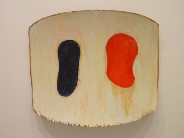
Flat Frontal at
Schema Projects
http://schemaprojects.com/exhibition-FlatFrontal.html
This Bushwick gallery presents
a vivid array of brightly chromatic and loosely geometric works, which emphasize
references to fabric design and handmade patterns that might conjure up
primitivistic sources.
Margrit Lewczuk’s curvilinear symmetries incorporate a playful,
Matisse-like notion of design. Their clean simplicity invokes a pleasing purity
of line and color.
Meg Lipke’s rambunctiously enthusiastic colorations invoke jungle
influenced batik.
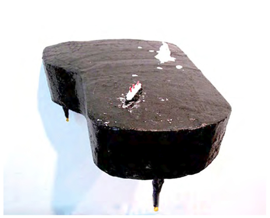
Lawrence
Swan, aka “Lars” has installed one of his deceptively casual 3D pieces
that establish an understated, yet compelling presence using a kind of off-hand/short
hand expertise found in origami.
His budding, pinstriped flower unfolds, revealing a star-shaped stamen. This germane germination turns a mundane sheet of paper into a
blooming blossom of artful modesty.
Swan’s funky and fun collage is assembled from torn squares
of art paper to which the artist applied washes of color. This lively banner
evokes semaphore signals, or a Klee-like compendium of kaleidoscopic
quilting.
The artist’s gently folded black & white grid may harken
unto (or vice versa) his wife Lori Ellison’s current paper pieces fabricated
from crumpled up paper.
S.S.
Champlain Presents: David Dixon “Temple Mount” (A God Named Pollock)
Correct me
if I’m wrong, but isn’t conceptual art supposed to be a bore (yawn)?
Not when
David Dixon brings his droll and scintillating gift for story telling to the
fore. The art world needs more minds like Dixon’s to throw at the pressing
issues of the day; such as pissing on Jackson Pollock’s grave.
Indeed
urination as an art medium may not be a new concept, but the artist does give
new meaning to the term “streaming live”. Dixon’s novel tale is not so much a
metaphor for Pollock’s painting style, as it is about misogyny and feminism.
Apparently
Pollock used to go outside his studio to pee on some small rocks and pebbles.
After Pollock’s death, (and internment under a large macho boulder) Lee Krasner
gathered all the pissy stones from Jack’s pissoir and used them for her much
more modest gravesite.
Was this a
sly bit of ironic feminist commentary, or just a fond
farewell gesture to the king of the chauvinist gesture?
The artist
(Dixon) has not completely forsaken traditional media here, although he has
upended it with this installation piece. Making a carefully reproduced 3D paper
mache replica of the Pollock grave boulder (complete with bronze plaque), he
somehow managed to affix the thing to the ceiling of the gallery, thereby
enabling the viewer a bird’s eye view (albeit upside down).
This is a
typical Dixon subterfuge. He delights in reorganizing our perception and
conception of events and creations we thought we knew. Dixon’s suitably ingenious
"Stand-up
Philoso-comedy" critique of Courbet’s “A burial At Ornans” enters into the realm
of poetry slam and performance (art?), and will leave you doubting the veracity
of Jansen.
To top it
all off (his head that is), the artist is currently working on a post-life piece, wherein
his skull will be preserved in perpetuity. Since one of my favorite art
installations is the Capuchin Crypt “bone bonanza”, I’d say he might be onto
something.
"What
you are now we used to be; what we are now you will be..."
Jeanne
Tremel, Wood Paper Paint, Handworks Gallery, Blue Hill Maine
What took me
so long you might ask. Just don’t want to be accused of favoritism. (well OK,
she is my favorite)
But this
does seem like a perfect opportunity to present my wife’s plein air art to the
blogosphere. I also take some pride and joy in that I introduced Jeanne to
painting outdoors up in Maine a few years ago. Initially she was slow to take
it up, calling it the hardest thing she’d ever done as an artist.
Of course I
find that hard to believe since Jeanne is one of those rare artists that have
the golden touch. She was born a painter, with a nimble touch, and painterly
insight.
The exhibit
at Handworks prominently features Jeanne’s watercolor works on paper. Marcia
Stremlau who owns the gallery, generously hung Jeanne’s work in a continuous
line on the best wall. We were
very pleased.
Blue Hill is
an affluent Downeast enclave with a long tradition of summer arts activities
that Handworks has been a part of for many years. I like the way this exhibit
combines more traditional crafts with fine art. Craft is a staple of the Maine
art scene, and although it might be considered gauche in NYC, the interaction
of utilitarian and decorative items with more purely visual art, refreshes my
eye and reminds me that this area is about the relaxed pleasures of getting
away from it all.
Jeanne’s impetus
for plein air is based on an intimate relationship with the foreground,
featuring rock and lichen that show off her predilection for quirky, detailed
line, then nuanced washes are delicately blended into a diaphanous background
region of sky and ocean.
 |
Bubbly Waves on a Foggy Day
watercolor on paper
12" x 9"
2012
|
She works
almost exclusively with dry watercolors from a tray, which imbue the picture
plane with a pale translucency appropriate to the elusive flux of climate,
light, and tide.
The trick
with interpretative plein air watercolors is to find an equilibrium that
encompasses a range of effects, but is contained within a specific pictorial
structure. Jeanne has a knack for finding just the right combination of
ingredients that bring a distinct sense of time and place to her intricate
compositions.
While her
studio work with oil paint could be considered an exploration of the inner nature
of psychic turmoil, the plein air etudes waft dreamily towards a cathartic
sensation; akin to warm basalt ledges, bathed in misty sun, and caressed by
frothy surf.
Cynthia
Winings Gallery, Blue Hill Maine
This
ambitious new exhibition space is located in an historic old Maine saltbox,
whose previous incarnation was Judith Leighton’s gallery, one of the grand old
cranky dames of the Downeast art scene.
Ms Wining’s
courageous undertaking to breathe new life into the old legacy is admirable. Winnings
is a transplanted New York artist herself, and CWG follows the recent Bushwick
movement of artist run galleries.
She is
helped by the wonderful upstairs/downstairs exhibition space architecture
involved. Abundant natural light filters nicely with the artificial. Thick wood
beams lend a sturdiness to the open floor plan of this spacious barn-like
structure.
The inaugural
show features a mix of local and New York artists whose work, though at times
influenced by Maine’s landscape, avoids the coyness that can inflect regional
art. Winnings is taking a leap of faith here, the tried and true formula for
many Downeast area galleries is not to rely exclusively on fine art that
challenges the viewer too strenuously.
CWG may end
up filling a void, but the question is will local summer collectors be enough
to support an endeavor who’s only mission is to present innovative visual art? I
hope so.
 |
| Heather Lyon "Protective Object" (series) |
 |
| David Hornung "Evergreen" |
|
|
| |
 |
| Cynthia Winings "Constellation on the Horizon" 2013 Gouache and collage on paper, 6 x 6 inches |
 |
| Ms. Winings | | |
|
|
|
Duke Ellington’s Mount Harissa (Far East Suite)
http://www.youtube.com/watch?v=gGNS9flNwiU
This must be one of the Dukes’s most suave and scintillating recordings.
Billy Strayhorn’s collaboration makes everything go well, while the piano riff at the beginning and end encompass everything that makes American jazz great.


